Enhancing Navigation In Pune Metro Station

About
My Role
Research, Ideations, Information Architecture, Interaction Design, Low-fi Prototyping, Hi-fi Prototyping, User Testing
Tools

Duration
13 weeks
Location
MIT, Pune (Dissertation Project)
Check it out
Refined Pune Metro app
Design Challenge
How might we help physically challenged individuals achieve independence while riding public transport in India?
The goal of this project was to successfully guide elderly, visually and hearing impaired in public transportation. With my professors guidance we narrowed down the focus, and chose Pune Metro Station, which was a significant highlight at the time. The project aimed to promote public transportation usage among these users who are not confident to travel independently. By prioritizing inclusivity, we sought to provide real-time navigation, personalized preferences, accessibility settings, streamlined ticket booking, and feeder services.
Key Features
Ticket Booking and Scanning
Addressing the difficulty visually impaired users face with barcodes, we introduced a QR code system. Users can book and scan tickets easily, with options to share or save the ticket for offline use, enhancing convenience and accessibility.
Indoor Navigation
To help users navigate the station independently, we implemented an indoor navigation system. Using a mic-enabled feature, users receive voice-guided directions to locate platforms. The app also notifies them about train arrivals, schedule changes, and provides alerts one station before their destination.
Platform Assistance
Users can contact platform authorities directly through the app. This feature connects them to on-site staff who can provide guidance and send volunteers if needed. To address language barriers, the service is available in English, Hindi, and Marathi.
Indoor Navigation
The app assists users from the moment they enter the station, helping them access lifts to avoid stairs. It guides them throughout their journey with notifications and allows sharing their status with loved ones for safety.
Scan & Share
Users can easily book tickets by selecting source and destination, choosing one-way or round-trip, and selecting a payment option. The ticket is then confirmed and displayed on their screen.
Assistance
Available in English, Hindi, and Marathi, this feature ensures spontaneous support from on-site volunteers when needed.
Real-time Schedule
Find route details displays real-time train schedules, estimated travel times, fare details, and information about any required interchanges, ensuring users have all the necessary information for their journey.
Enhanced Accessibility
The app offers voice assistance through a mic, a vibration mode for the hearing impaired, and customizable notifications. Users can easily adjust settings to suit their needs, ensuring a smooth and accessible journey.
Feeder Services
Upon exiting the station, users can search for nearby services and filter options based on the number of people, fares, and distances, ensuring a seamless transition to their next destination.
Process
Throughout these 13 weeks, we divided our research and design process into three primary categories:

For the 26.8 million Indians living with disabilities, lack of accessible transportation not only limits their mobility, but also access to education, healthcare, and economic opportunities.

Research Opportunity
By integrating insights from the current metro system blueprint with real user feedback from app reviews, we identified key opportunities to enhance the overall user experience and address critical pain points like usability issues, lack of accessibility features, and unreliable real-time information.

Comparing accessibility infrastructure in other countries provided surprising and inspiring data

Japan
Kenji, a traveler with a hearing impairment, navigates Japan using special lifts, ramps, and an innovative service enabling calls via online assistants. Despite some digital accessibility gaps, these features greatly enhance his journey.

Germany
Emma, a wheelchair user, finds Germany's public transport incredibly helpful with buses and trams equipped with secure straps, lowering platforms, and designated seating for disabled passengers.

Canada
James, a visually impaired traveler, enjoys Toronto’s accessible transport system, which includes audio tours, braille guides, and adaptive skiing programs in Whistler.

Italy
Maria, a wheelchair user from Rome. By improving its transportation system, overcoming architectural and sensory barriers, and committing to full engagement with its disabled inhabitants, Italy has become a model of accessibility.

Spain
Peter, a traveler with cerebral palsy, who finds Barcelona exceptionally accessible. Spanish railway stations feature ramps, visual and auditory reinforcements, and lifts.
Insights
We gathered our research reflecting this problem space:
There is a critical need for improved sensory features and consistent support to enhance accessibility for visually and hearing-impaired users.
Prioritizing user-friendly design and robust real-time updates can significantly improve user satisfaction and usability.
Incorporating proven global best practices can elevate the standard of accessibility in our metro system.

Research Observations
Studied other competitors to compare features and find opportunities to improve accessibility

Then, we interviewed individuals and gathered valuable insights from stakeholders.
Time for some real stories from my field visits:

Insights

Ideate

Affinity Mapping helped me to organize and make sense of the collected data by grouping related ideas and observations together.
I divided the insights into three main segments:
Recommendations: The actionable suggestions derived from the research, focusing on improvements and new features
Feelings: Captures the emotional responses and sentiments of the users regarding their metro travel experiences.
Frustrations: Includes the pain points and challenges faced by users, highlighting areas that require significant improvement.
How Might We Questions

-These questions were designed to reframe challenges into opportunities for coming up with creative solutions.
Brainstorming Ideas
Later, I brainstormed ideas through Mind Mapping, focusing on sections including:
Visual clues and Signages
Platform Navigation
Navigation Assistance
Information and Announcements
Ticketing and Entry
Entry and Exit points
Building Awareness
Security and Safety

Feature Priortization

-I sorted ideas based on priority and feasibility—making sure the best ideas get the spotlight!
Structure
Next, I organized the features with Information Architecture, to set the stage for the prototyping phase.

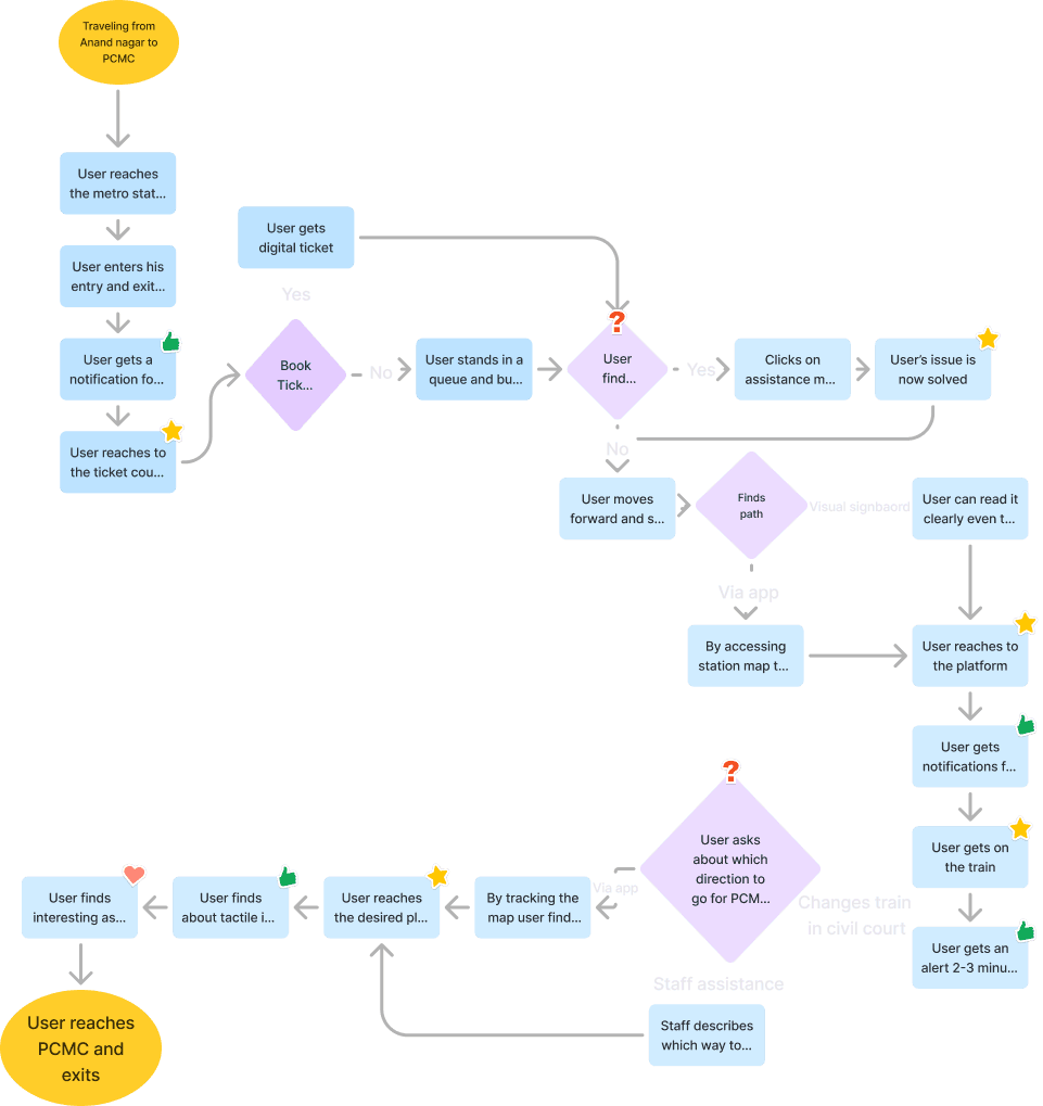
User Flow
For the User Flow, considering the journey of a traveler moving from Anand Nagar to PCMC with interchanging train at Civil Court, (also known as India's largest metro station)
Sketches- Paper Prototypes and Wireframes

-sketched out some ideas and thought about what the app and user interface might look like.
Moodboard
To maintain consistency, I designed a mood board combined with design system aligned with the Pune Metro app's existing design including:
Accessibility Cues
Colors: Orange symbolizes warmth and culture; Blue represents fluidity and ease
Navigational Assistance ensures clear direction and easy access to facilities for all users
The rounded icons are chosen to deliver a sense of consistency
A character that could guide the user throughout his journey

The friendly Alligator acts as a navigator, guiding users throughout their journey.

Initial Designs

Framed our sketches into designs, incorporating elements from the concepts, such as booking tickets, checking schedules, searching for nearby feeder services, and finding nearby stations.
The designs also included real-time navigation for user journeys through stations, platform assistance for emergencies, and accessibility preferences like updates and alerts, vibration mode for hearing issues, and mic features.
This helped confirm our design decisions before refining the final prototype.
User Testing
I reached out to some users during my metro travels and some of my friends to validate the design decisions. Testing with paper prototypes and initial designs, I quickly gained valuable insights into the user group's mental model.
They addressed minor issues like:
Connectivity Issues: Due to low connectivity in metro stations, tickets booked online often fail to save, and there's no option to share the ticket, which is especially problematic when booking for someone else.


Exit Stations: Users find it difficult to determine which exit point of the metro station is closest to their desired destination, often needing to ask volunteers for assistance.
Route Details: Passengers are unaware of route details such as the time it will take to reach their destination and the number of stations where they need to change trains.

User Journey

Iterations & Final Designs

Reflections
I found that these features were really useful to the user base I tested with. It gave them a sense of trust and guidance at every step of traveling in the metro stations.
Most importantly, I had the opportunity to work with a very different set of user base and this really expanded me as a designer to work on inclusivity.
Impact & Takeaway's
Towards the end of this project — I got a chance to present this in front of Pune Metro Authorities

"I believe achieving inclusive design means that we iterate on our scope to anyone who easily makes errors on bus rides and how we can help them, including anyone with disabilities, non-native speakers, and first-time riders."